### Context / Problem
Sometimes in order to save space or just for the fun of making a cool effect you might want to create a flippable card. What's that? A card that when you hover (or click or whatever you want) it rotates and shows the back of the card with some extra information.
### Solution
If we think about how we would do it in real life, we would need two cards, set them back to back and make sure that we rotate them whenever we hover on it. Sounds easy, right?
To achieve this first let's understand the structure of the `html`
```html
<div class="flippable-card-container">
<div class="flippable-card">
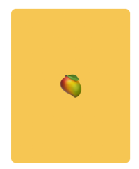
<div class="card__face card__face--front">🥭</div>
<div class="card__face card__face--back">🌴</div>
</div>
</div>
```
The `flippable-card-container` will be the one we'll hover and the `flippable-card` the div that we'll rotate.
Let's add some styling to the `flippable-card` and to the front and back faces:
```css
.flippable-card {
transition: transform 1s;
cursor: pointer;
position: relative;
width: 200px;
height: 260px;
}
.card__face {
position: absolute;
width: 100%;
height: 100%;
line-height: 260px;
color: white;
text-align: center;
font-weight: bold;
font-size: 40px;
border-radius: 8px;
}
.card__face--front {
background: #ffc432;
}
.card__face--back {
background: #0ed600;
}
```
So far we should have something like this:
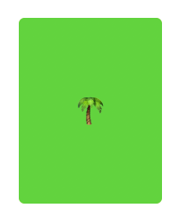
We can only see the back face now because in our html that's the last element we coded.
Now we'll rotate the `card__face--back` and make sure we tell our css that we don't want to show the `backface` of the element, that should make the `card__face--front` visible 👇🏻
```css
.card__face--back {
transform: rotateY(180deg);
}
.card-face {
[...]
backface-visibility: hidden;
}
```
If everything goes well, you should see the front face of the `flippable-card`.
Now let's make the magic happen by adding a rotate effect on the `flippable-card` when we hover on the `flippable-card-container`.
```css
.flippable-card-container:hover .flippable-card {
transform: rotateY(180deg);
}
```
Ok, it rotates now but it only shows the front card, to fix this we need to tell the `flippable-card` that the child elements should preserve it's 3D position.
```css
.flippable-card {
transform-style: preserve-3d;
}
```
And we are done! 🎉
You'll see that the rotation is completely horizontal, if we want to make it to rotate with a small vertical 3D effect we can add:
```css
.flippable-card-container {
perspective: 600px;
}
```
The `perspective` property defines the distance between the user and the element on the screen, that's why we get that 3D effect when it rotates.
See it in action 👇🏻
See the Pen
Flippable Card - CSS by Nico Proto (@nicoproto)
on CodePen.