### Context
We all love a good linear gradient, right? We use it in our logo so of course we love it too.
A linear gradient can be easily done with just applying the `linear-gradient` property on an element. But what happens if we want to add a hover effect on it? Using most property transitions wouldn't generate any problem but there's one that it's a bit tricky so... of course we'll try that.
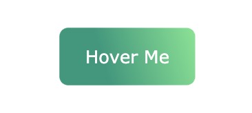
Let's say that we want a button that looks like this:
And what we want to do is to animate it smoothly into this:

### Problem
The first thing we could try is to just change the `linear-gradient` when the button is hovered. Well... this it's not going to work. Why? Because `linear-gradient` is not a property that can be animated ([see all animated properties](https://developer.mozilla.org/en-US/docs/Web/CSS/CSS_animated_properties)).
### Solution
To make this work, we will create a layer on top of the button with the opposite gradient and we will animate the `opacity` of that element when we hover on the button.
The best approach for this would be to add a `:after` pseudo element, with the same dimensions of the button.
See it in action 👇🏻
See the Pen
Button gradient - SCSS by Nico Proto (@nicoproto)
on CodePen.